A patient of the clinic does not see workflows or models: they see a button in the corner of the site, a panel with the assistant's name, a few suggestions to get started and, when they book an appointment, a card with the date and the location. On WhatsApp they see text and a few buttons to confirm. This chapter explains where each of those things comes from and who defines it: the tenant, the agent or the page where the widget is embedded.
How the widget builds its appearance
When the widget opens, it makes a single request to the agent and receives everything it needs: the display name, the welcome texts, the suggestions, the allowed attachments, the visual theme and the card templates. If the site is not among the tenant's allowed origins, the request is rejected and the widget does not load (chapter 6).
There are three sources, and it helps to tell them apart:
| Source | Defines | Where |
|---|---|---|
| The tenant | Visual theme, launcher, panel, widget footer | Experience → Agent Appearance |
| The agent | Name, welcome, suggestions, attachments, languages | Agent detail |
| The page | Launcher position, its icon, panel width and mode | Embed code attributes |
The tenant theme
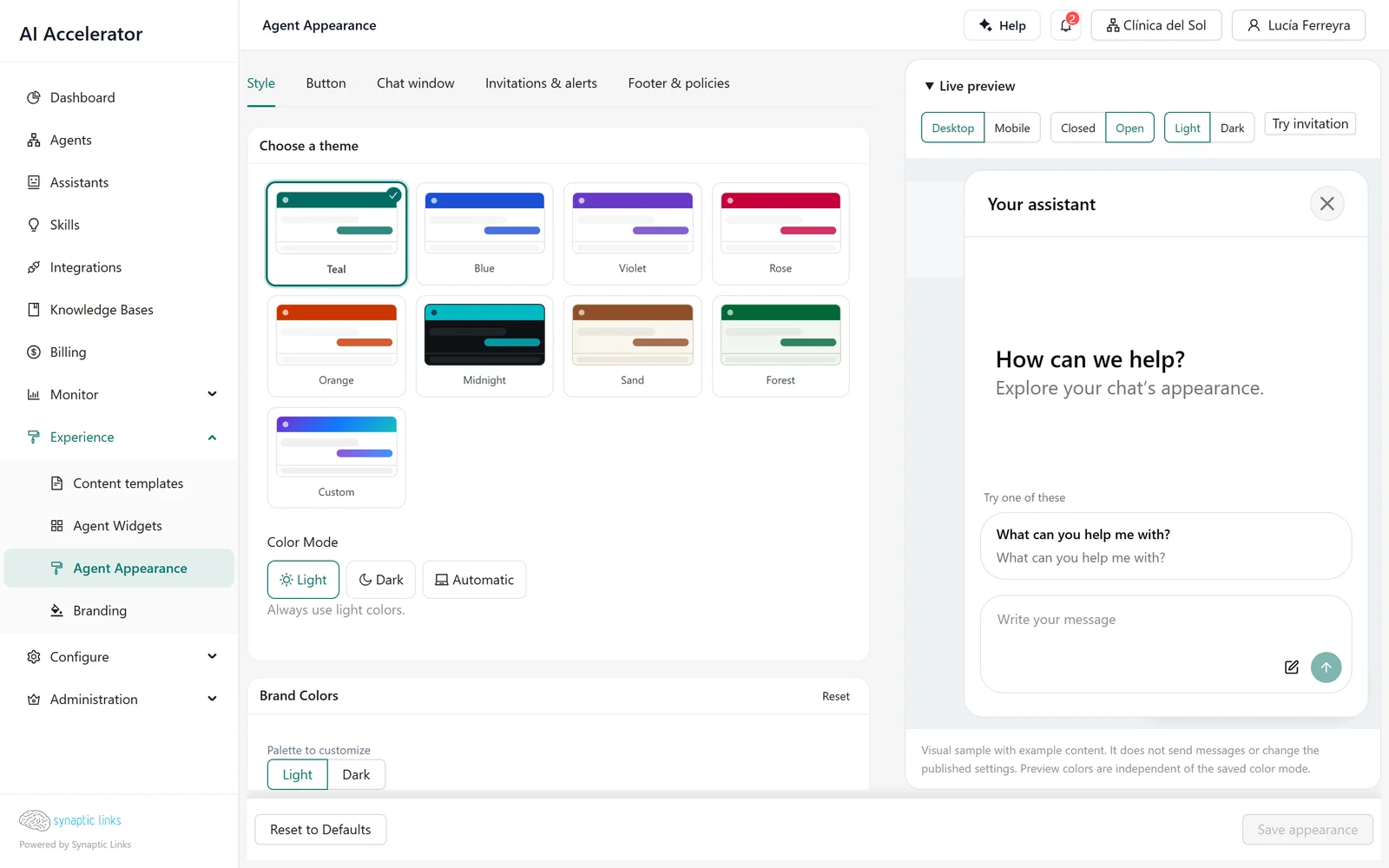
Agent Appearance has an editor with a live preview and five tabs: Style, Button, Chat window, Invitations & alerts, and Footer & policies.
- Style. A color preset (teal, blue, violet, pink, orange, midnight, sand, forest), fine-grained per-color adjustments for light and dark mode, typography and color mode —light, dark or automatic based on the device—. Choosing a preset discards the fine-grained adjustments.
- Button. The launcher's shape (circle, pill, side tab), size, position, icon, text, animation and sound. Also the invitation: a message that appears after a delay or after inactivity, with rules per page and device, and a frequency per session or per day.
- Chat window. Width (from 320 to 800 pixels), corner rounding and shadow.
The theme belongs to the tenant, not to the agent: all of the clinic's agents share the same appearance. If a tenant has no theme of its own, it uses the one from its nearest ancestor that has one; if none does, the default teal. Inheritance applies to the whole theme, not field by field.
The widget footer and the agency's brand
The footer is a short link under the message box: "Assistant built by Nortelink", for example. It has two levels:
- Mandatory tenant policy. If Nortelink defines a footer on its account, it applies to all of its clients, and none of them can replace it: in child accounts it appears as inherited and locked. The policy defined highest in the tree wins.
- The agent's own footer. If there is no mandatory policy, each agent can have its own, in its chat configuration, if the tenant has that feature enabled.
The Branding section (logo, platform name, colors, favicon) is something else: it customizes the admin and is used in emails and content templates. It does not change the widget.
What each agent defines
In the agent detail, the chat experience section defines, per language:
- Display name in the panel header.
- Welcome title and description, shown before the first message.
- Starter prompts: buttons with a short text and the message they send. The clinic uses "Book an appointment", "See test preparation instructions" and "Location hours" ("Sacar un turno", "Ver preparaciones para estudios", "Horarios de las sedes"). The starter prompts also feed the launcher invitation.
Texts are not translated automatically: each language is entered by hand. If the visitor uses a language with no texts, the base language is tried (from es-MX to es) and then the tenant's default language. The widget interface itself is in Spanish or English.
Attachments. Each agent decides whether it accepts images, documents or audio. They are off by default; when enabled, the limit is 20 MB and five files per message, with a configurable maximum of 50 MB and ten files.
Panel modes
The embed code chooses how the chat is presented:
- Side: a panel fixed next to the launcher, which the user can widen on large screens.
- Inline: the chat fills a container on the page, always open, with no launcher or invitation. It suits an "Online support" page where the chat is the content.
The floating mode exists as an option, but today it looks the same as the side mode.
Cards: structured responses on the web
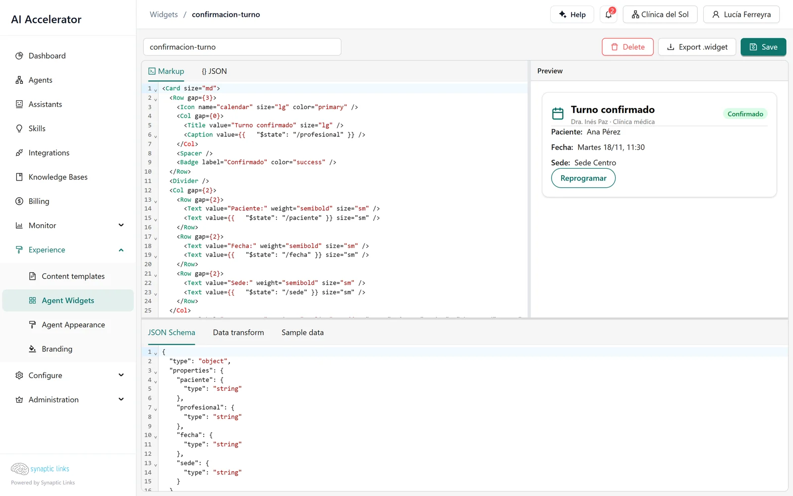
A text response is enough for a question. To confirm an appointment, a card is clearer: title, patient, date, location and a button to reschedule. Cards are defined as widget templates in Experience → Agent Widgets:
- The layout: a tree of components —card, rows, texts, badges, buttons, tables, charts, forms—.
- The data schema: which fields it receives. Anything not in the schema is not shown, and fields such as passwords or tokens are always discarded.
- The transformation: where each field comes from in the source data.
- Sample data for the preview.
The AI Builder tab lets you describe the card in a conversation and save it as a template.
An agent shows a card in two ways: by associating a template with a tool in its router —every time that tool responds successfully, the card appears with its result— or by having a model step produce its output with a template. A card's buttons can open a link, copy a text or send a message to the chat, visible or hidden.
The same appointment on WhatsApp
WhatsApp does not show cards: widget templates are only for the web chat. On WhatsApp, the appointment confirmation is handled with an approval gate in buttons mode (chapter 3): with up to three options, the user sees reply buttons; with more, a list of up to ten. The user's reply resumes the workflow with the chosen option.
If the confirmation text has to be the same on every channel, a content template generates it once (see below), and the workflow uses it in the response.
Content templates: reusable formatted texts
Experience → Content templates stores texts with variables —in HTML, text or Markdown, with several parts—, for example the subject and body of a reminder email. They are written in a template language, previewed with sample data and published. The Content template node in a workflow fills them in with data from the conversation and leaves the result for the following steps; it does not send anything by itself.
They are inherited like everything else: the tenant's own, the ancestor's or the platform's. There is one version per language, and the language has to match exactly.
Where it stops
- There is no per-agent appearance: the theme belongs to the tenant, and the page only adjusts position, icon, width and mode.
- The editor does not show an inherited theme: if the tenant has no theme of its own, the editor starts from the default teal even though the widget uses the ancestor's.
- The panel header style is saved but does not yet change anything in the widget.
- The floating mode looks the same as the side mode.
- The Branding section does not change the widget.
- Cards are only for the web, and if an agent references a template that does not exist, the turn fails.
- On WhatsApp, buttons come only from approval gates, with up to ten options and short labels.
- Content templates need the exact language and only produce text.
To check
- The theme and footer are defined on the right account: on the agency's if they are common to all clients.
- Each agent has a name, welcome and starter prompts in every language it serves.
- Attachments are enabled only on the agents that process them.
- The cards an agent uses exist in its tenant with the same name.
- On WhatsApp, user decisions go through gates with labels of up to 20 characters.